ShopDreamUp AI ArtDreamUp
Deviation Actions


Suggested Deviants


Suggested Collections


You Might Like…


Featured in Groups


Comments49
Join the community to add your comment. Already a deviant? Log In
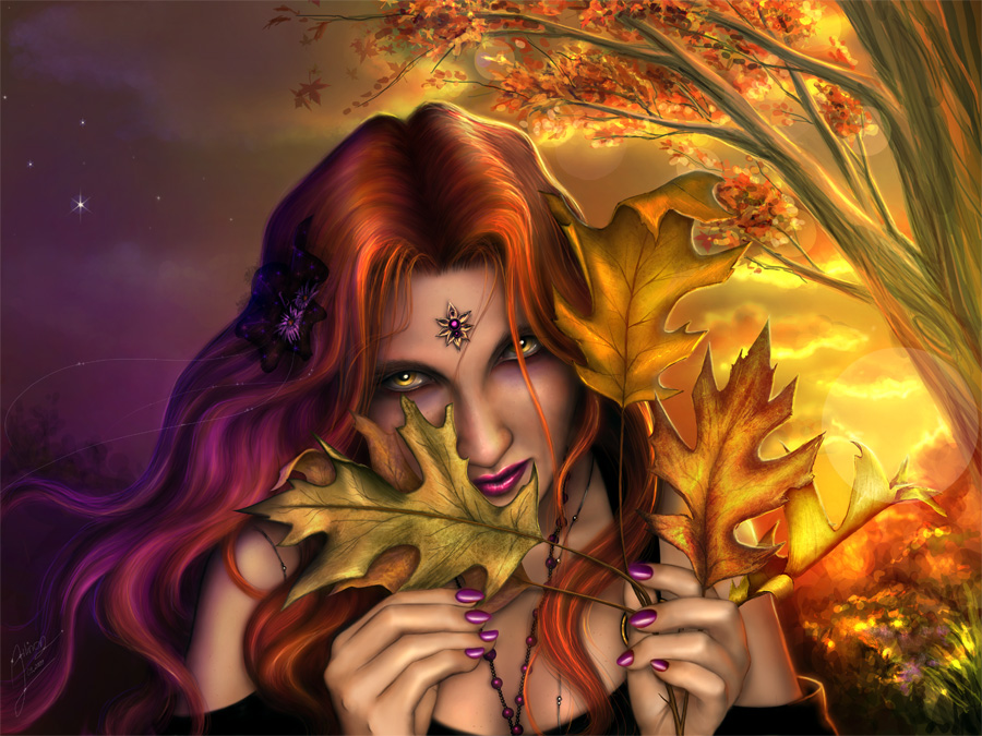
Beautiful work. Drop-dead ga-ga gorgeous but it's got a few flaws in it.
The positive: Your use of color is brilliant. The contrasting colors here make the image pop, and the balance between them is pretty damn good. The composision is balanced, if a little on the busy side. It's eye catching and beautiful. Good anatomy, good concept.
Negative: It's a little on the flat side. You're using a poser model as a reference (I recognise both the shading and the bendy look of her fingers from my own models). There is nothing WRONG with using a poser model as a ref, but certain areas, like fingers, are inaccurate. Do a couple studies using real life or photographs of hands and faces.
Poser refs also severely bork shading with skin. Unless you (1. Turn on subsurface scattering and (2. Are really, really good with Poser, you wind up with plastic skin. When you paint off that ref, you wind up with plastic skin that looks really dirty. I know this, because I used to do this. You can fix this by blending your own color pallate and using those colors instead of the render's. It takes a lot of time, but once you have three or four good pallates, you're golden. Also, use black as a shadow color as a last resort. Use more pinks, purples, browns, ect.
You can push your shading a little bit more by adding a second light source: A thin line of very bright, almost white color down the shadow side of her limbs, hair, leaves, ect. You see that orange line on her dress, on the right side? Put a purple/blue line on the left. This implies three dimensions, visually, and gives everything depth.
Finally, you've crowded your elements around her face. Leaves, hands, jewelry, facial features and hair all "read" as seperate objects, and of those objects, the eyes have the most impact. I think if you dumped one leaf and that thing on her forehead, you'd have a cleaner composition, and a more emphatic image.
To sum up: Good work, lovely idea, good excution. If you continue to use Poser renders as references, use your own colors and boost your anatomical know-how with real life studies. Try simpler compositions in the future. I look forward to seeing more from you.